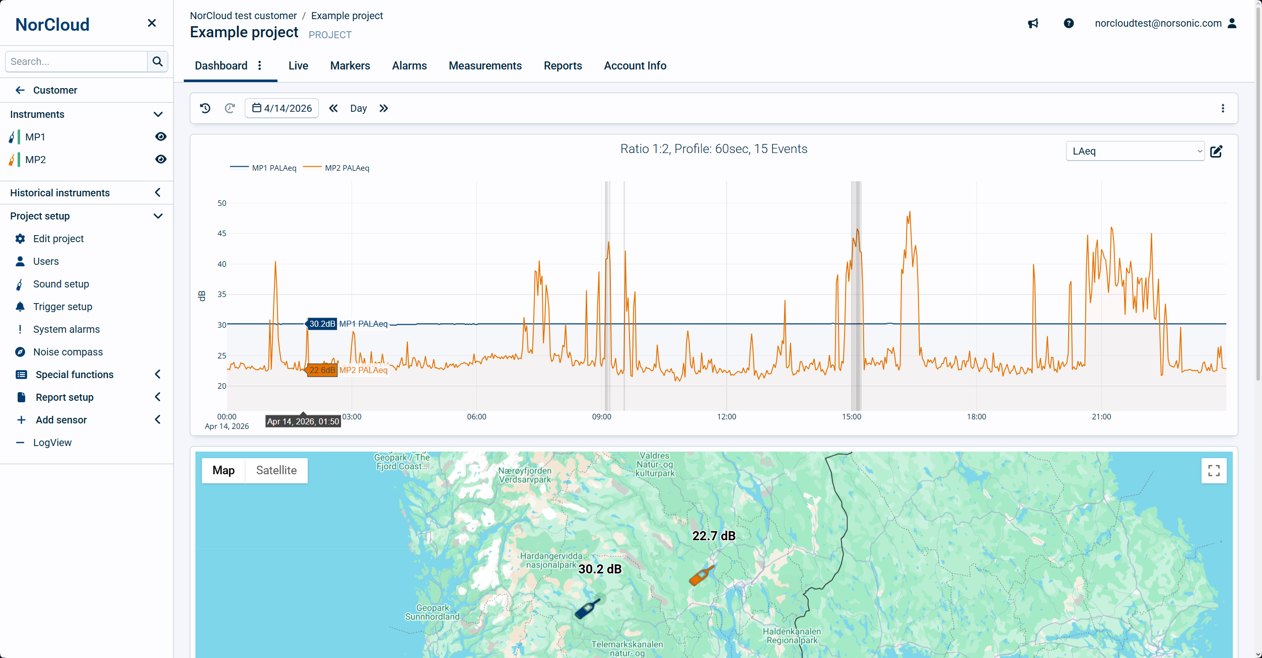
The dashboard (formerly named Graph) will display time profile graph of selected period for selected instruments. The map (including Noise compass), weather and events will be visible if its configured in the Data view setup. The order of display is fixed, showing the graph (including weather) at the top, map in the middle and event list at the bottom.
The Graph view in the Dashboard gives you the following time period selections:
oThe calendar for the wanted day.
oThe range selection will let you select the wanted period length:
oLive - The last current values will be shown.
The live view require the version 3.x for instruments. The live view has 2 different actions depending on the project setting "Measurement upload frequency".
Upload frequency set to Continuous: The live view will show you profile data for sound functions. Not weather or Noise Compass. The view will start from current time and data from instrument will stream for each profile length. If profile length is set to less than 1 second, the data will be stream each second.
Upload frequency set to Every hour: The data from instrument will be streamed every minute with LAeq summarized for the last minute. The period will be shown in the current 3 hours.
Please note that the Live view will not work if you are using https streaming.
oMonth - The calendar date will be set to the first in month and one month view, first to the last day of the month. Only global time resolution (one hour) values are supported in the month view.
oWeek - The calendar date will be set back to last Monday and one week view, Monday to Monday. Only global time resolution (one hour) values are supported in the week view. To view other days to and from, simply drag the x-axis to whatever day you wish to and from.
oDay - The calendar date will not be set, and the view will show the whole day from the time specified in the data view setting. If the clock is set to 00:00 in the data view, it is possible to drag the bottom axis to show other hours from and to.
oHour - Every whole hour may be selected.
oSpecial - When zooming (see below) within the graph you may select your own wanted period.
Generate report
Click on this to view the templates on which you can select one to generate a report from. Both text reports and report designer templates are supported.
It is important that you have selected a time span which the report will work properly with before you generate them. See above about time period selections.
Generate measurements
For shorter time periods, you are allowed to generate a complete, combined measurement data file for download. This is similar to entering the measurements tab and download the measurement data from there, except that the data is combined.
To download larger quantities of data, you have to use the measurements tab and download from there.
Analyze
For shorter time periods, you are allowed to enter the Analyze mode.
Graph overview
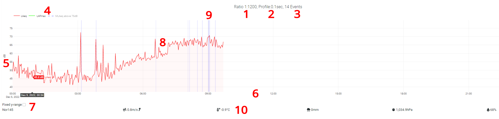
1.Ratio is one to the number of values in the view divided by 720. I.e. for the above view with time resolution 0.1 second it is 24*60*60*10 / 720 = 1200, giving a ratio of 1:1200. This means that 1200 values are compressed into one value to be represented in the graph. For equivalent values Leq, the numbers are averaged and for LFmax, the highest value of those 1200 is presented.
2.Profile is the time profile which is displayed. This is dependent on what is set in sound setup and data view. If multiple profiles are added in the data view, information about the profile with highest resolution will be shown.
3.Number of Events in this view. If clicking on Markers tab beside the Graph tab, you get a full view of the markers.
4.This is the legend for the graph including active Event triggers. Click on each of these (e.g. LAeq) to toggle the visibility of the corresponding line in the graph on or off.
5.The Y-axis shows dB for sound measurements. Drag this up and down to change the values to and from. The range of the y-axis is dependent on whether the "Fixed y-range" is checked or not.
6.The X-axis shows time. Use the time selector at the top to change this or drag it left or right to change the time start and end.
7.Here you select what lines and functions to display. This is set up in Edit LTGraph.
8.The main graph window is where you decide what lines to be displayed. See the Data view setup topic for information about how the graph line coloring works.
9.The vertically colored background bars are event/markers either created manually or automatically by using event triggers.
10.At the bottom is the weather bar showing sensor name and corresponding weather info, i.e. from left to right wind speed and direction, temperature, rain pressure and humidity. Rain will be accumulated and Wind direction will only be handled if wind > 1m/s. Each sensor with a weather sensor is displayed with it's own line.
Interacting with the graph
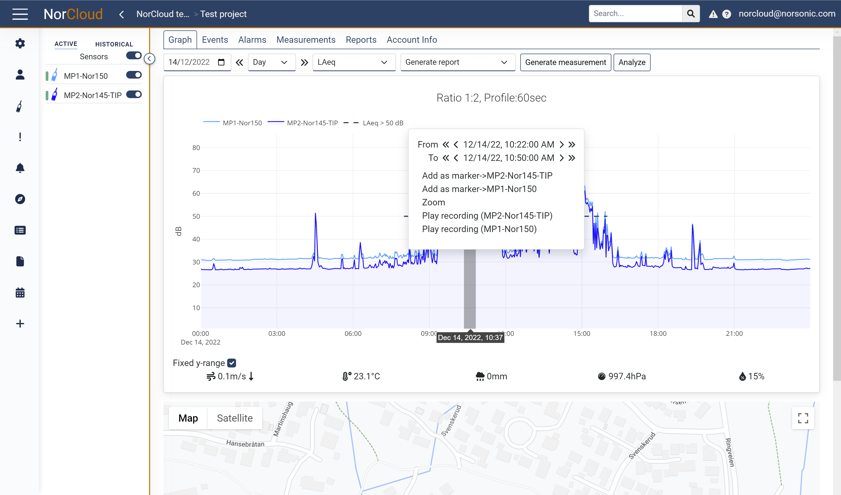
Drag left to right in the graph display to select an area where you can do the following:
•Change the time set from/to.
•Get recording. This requires that recording is activated, either continuous or you have selected an area with an event containing a recording.
•Add a marker in the marker list.
•Zoom in on the graph.
•1:1 means zoom to ratio 1:1 (see explanation on ratio above).
•To cancel the menu, click inside the area you dragged.
Interacting with the map
Please note that the map settings including placing sensors etc. have been move to the edit project settings. This map is read only.
Explanation:
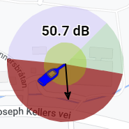
•The instrument (microphone) tip is pointing at the location of the sensor.
•The number above (50.7 dB) is the measured sound pressure level of the sensor at the selected time in the graph above by hovering the mouse. The first function of the selected data view is displayed, i.e., it can be e.g., LAFmax or LAeq.
•The outer circle sectors are the same as set up for the noise compass.
•The smaller background circle indicates visually the sound level. A large circle for high sound pressure levels and a small for low sound pressure levels.
•The arrow is the noise compass direction. The length of the arrow indicates the quality of the noise compass measurement, so a long arrow to the edge of the outer circle will be approx. quality 1, and a short arrow will represent closer to quality 0.
Left-click on the instrument icon to be able to do one of the following:
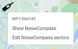
•Show NoiseCompass, this will display a small window showing the noise compass values in the bottom right corner. Hover the mouse in the graph above to noise compass data.
•To do more things in the map like move sensor positions etc., edit the project settings to do that.
Event list
Take a look here to get information about how to interact with the Event list. The actions here are the same as inside the Events tab.
Sensor visibility
Sensor visibility can be turned on and off with the switch ![]() . Turning these switches on and off will not affect whether the instrument is measuring (running) or not (idle/saved).
. Turning these switches on and off will not affect whether the instrument is measuring (running) or not (idle/saved).