When the ![]() Add graph button is clicked and L(f) Graph is selected, a window for setting up the level/frequency histogram is shown:
Add graph button is clicked and L(f) Graph is selected, a window for setting up the level/frequency histogram is shown:
Field name |
Optional / Required |
Data in field |
Information |
|---|---|---|---|
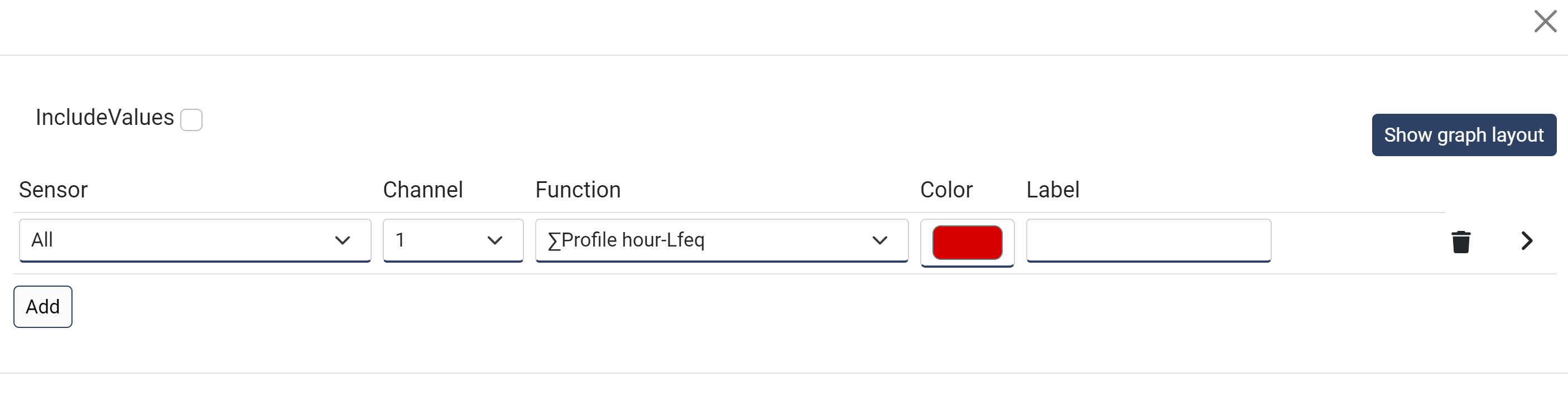
IncludeValues |
Required |
Toggle on/off |
When enabled, the values for each frequency is shown at the top of each bar. |
Show/Hide graph layout
Field name |
Optional / Required |
Data in field |
Information |
|---|---|---|---|
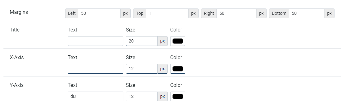
Margins |
Required |
Size in pixels for left, top, right and bottom |
What margins inside the container that the graph will have. |
Title |
Optional |
Text, (font) Size and Color |
Title for the graph, text placed at the top of the graph |
X-Axis |
Optional |
Text, (font) Size and Color |
Text for the horizontal X-axis. |
Y-Axis |
Optional |
Text, (font) Size and Color |
Text for the vertical Y-axis. |
Column settings (sensor, profile etc.)
When pressing the Add button, a new line will be created representing one or more columns containing data from the measurements according to the parameters given:
Field name |
Optional / Required |
Data in field |
Information |
|---|---|---|---|
Sensor |
Required |
All or single |
Select what sensor to show data from. If you are creating a generic report for several projects, it is required to use All. Selecting a single sensor will only work in this particular project as the NorCloud sensor ID are unique for each project even if their tic id is the same. |
Channel |
Required |
1 or 2 |
Select what channel on the instrument to display. |
Function |
Required |
Profile and function |
Choose Profile hour and select frequencies values for equivalent, maximum or minimum. Max. and min. values are connected to the time constant they have, i.e. fast, slow or impulse. |
Color |
Required |
|
|
Label |
Optional |
Text |
If nothing is typed here, standard notations are used depending on what profile and function is selected. |
Close the window to save the changes.
After saving the changes, graph lines with dummy data is produced to give an impression on how it is going to look.
Please note that the drawn graphs are drawn with dummy data and has nothing to do with the measured data. To test what a final report will look like with measured (real) data, save the template, then go to the project dashboard and select generate report with the file name (xml) you just saved to.